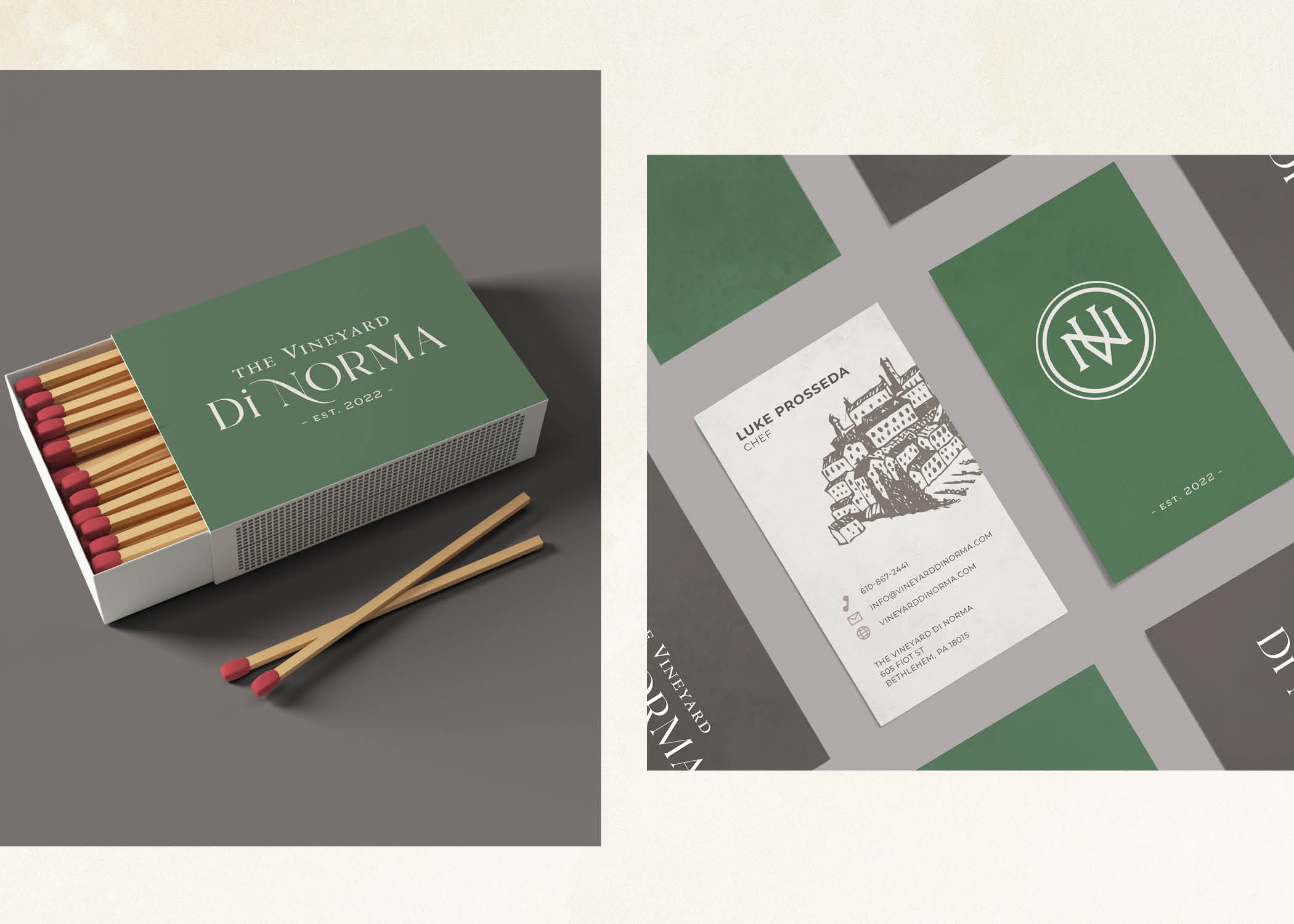
Identity work for a family-run Italian restaurant, rooted in the chef's heritage and farm-to-table philosophy — warm, modern branding carried through logo, menu design, and the full guest experience.
The Vineyard Di Norma is a family-run Italian restaurant with a story worth telling: a chef cooking from memory, from heritage, from the belief that food made with honest ingredients and real craft is worth slowing down for. The brand needed to carry that.
The identity draws from the warmth of the chef's Sicilian roots and the restraint of a modern dining experience — without leaning into the clichés of either. The mark is grounded and approachable, the typography graceful without being fussy. Together they signal exactly what guests will find: something personal, done with care.
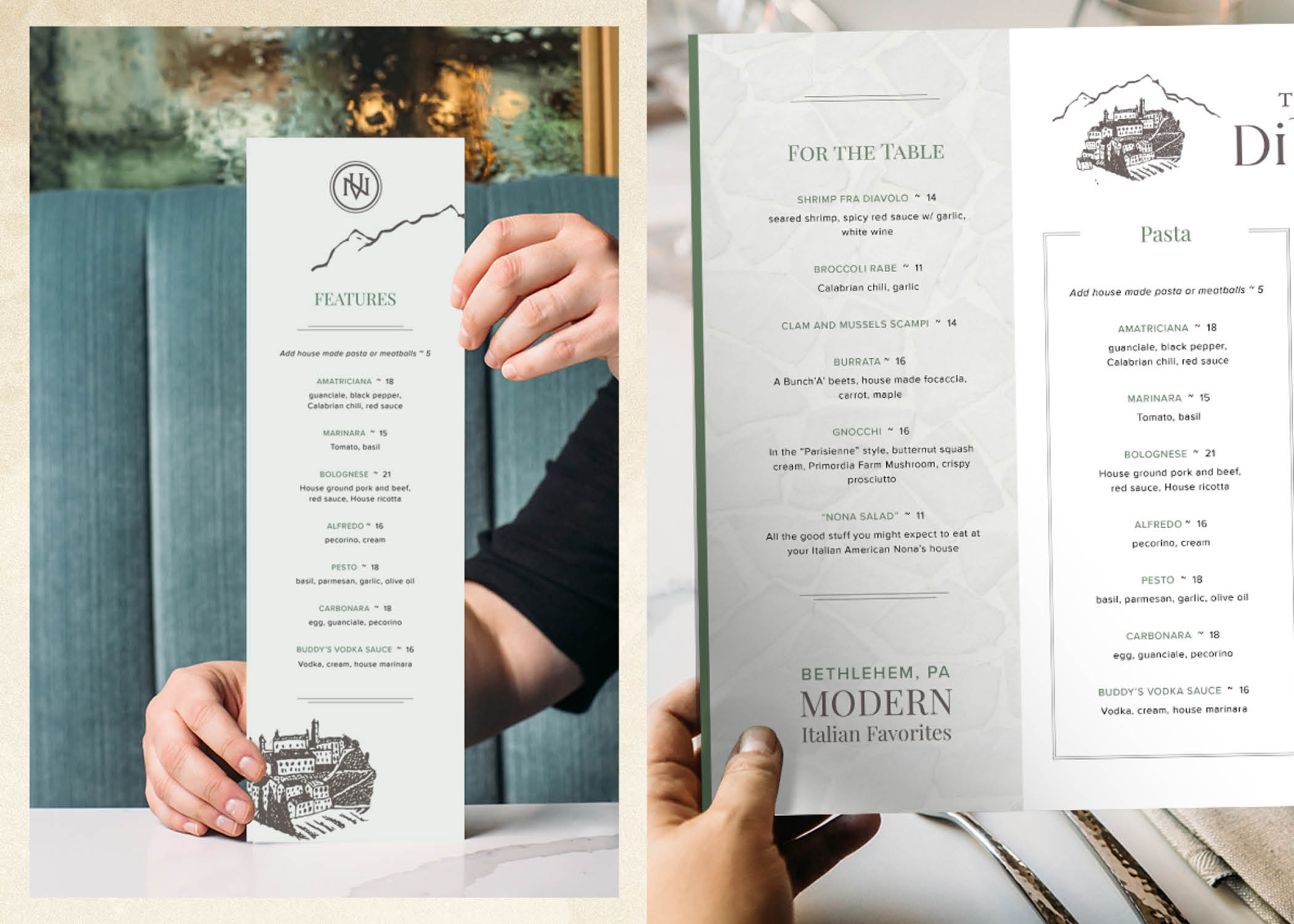
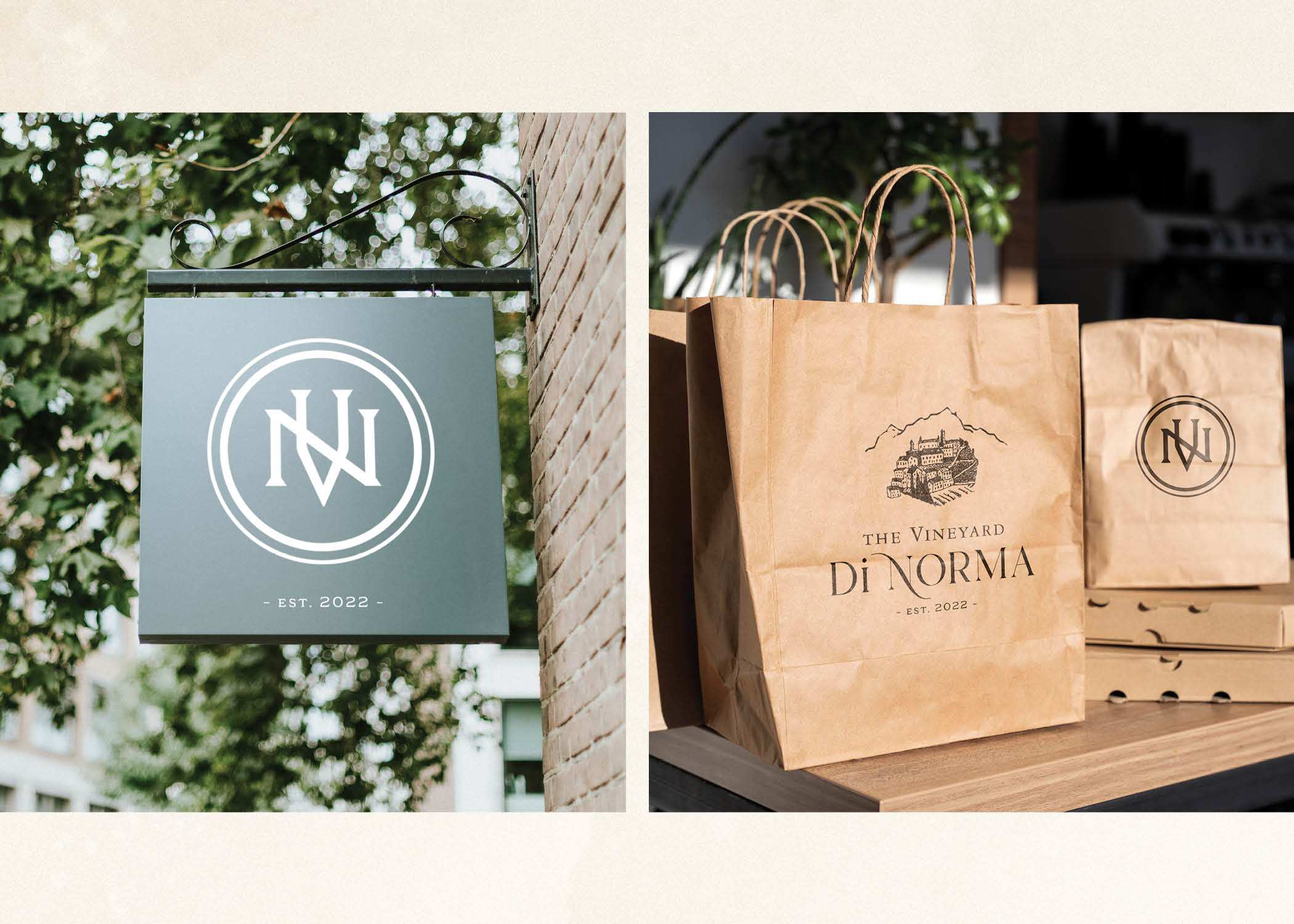
The system extends through every moment of the guest experience — from the menu they hold at the table to the way the space presents itself from the street. Consistent, warm, and entirely their own.